GUI — bokA.
The Project.
GUI examination · Design a system that help librarians and sales people put together suggestions of up to ten books in packages for different request.
- For: Hypothetical project
- By: Individual project
- My role: UX/UI Designer
- Duration: 4 days
Context.
Function specification:
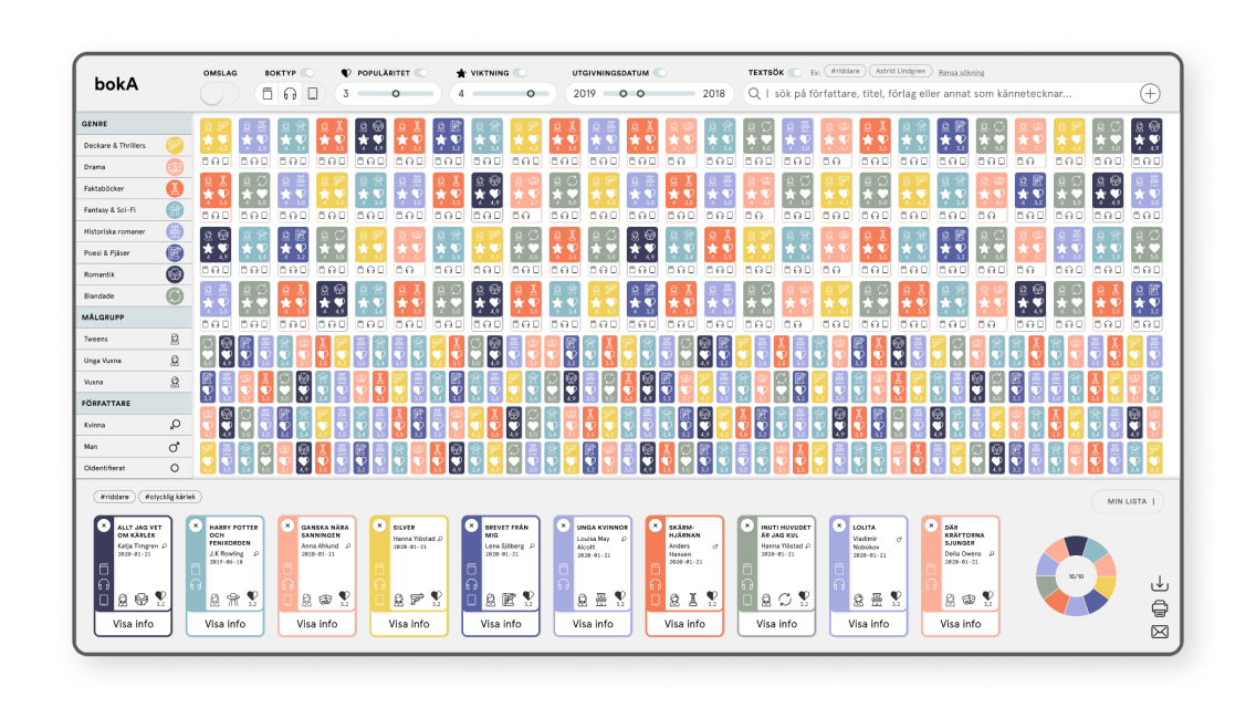
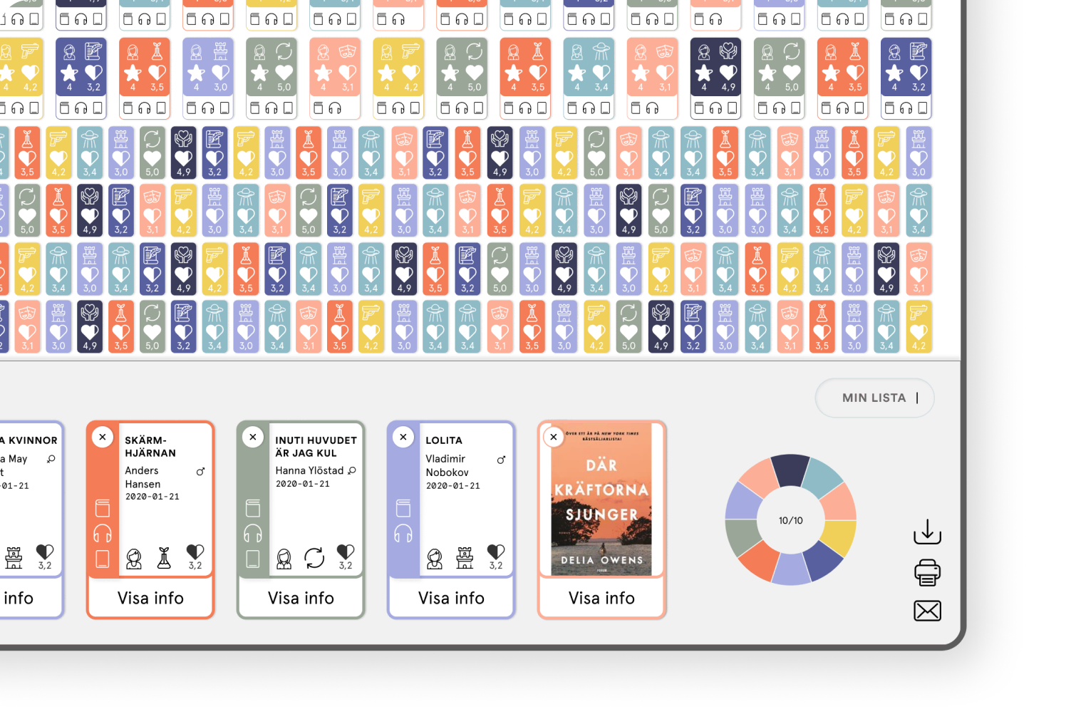
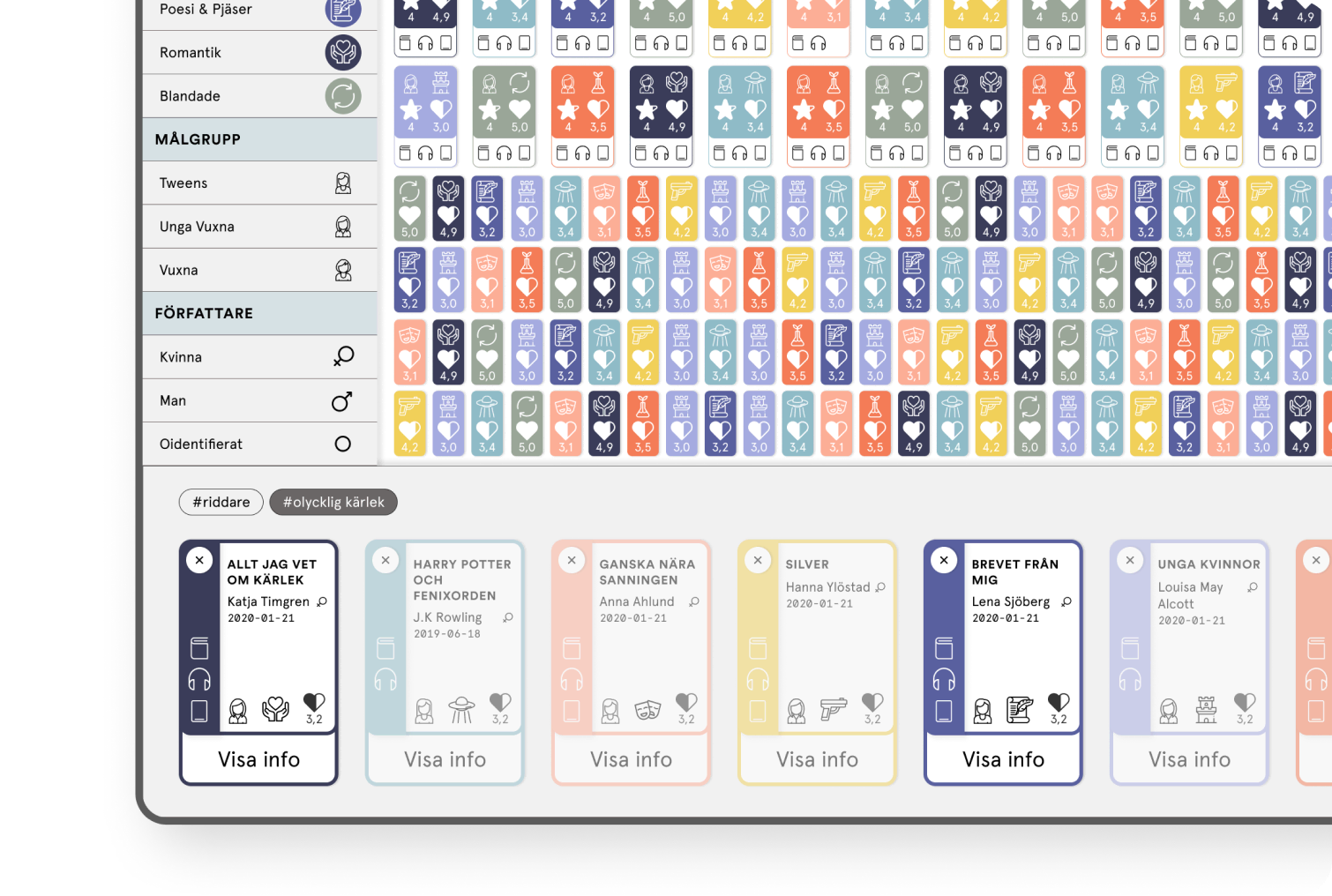
- Format: no more than 1850 x 1000 pixels, everything must be visible at all times, no dialogs, dropdowns, scolling or etc is allowed. (with one exception)
- The user must be able to put together packages of up to 10 books
- The user needs to be able to always see at least 300 books
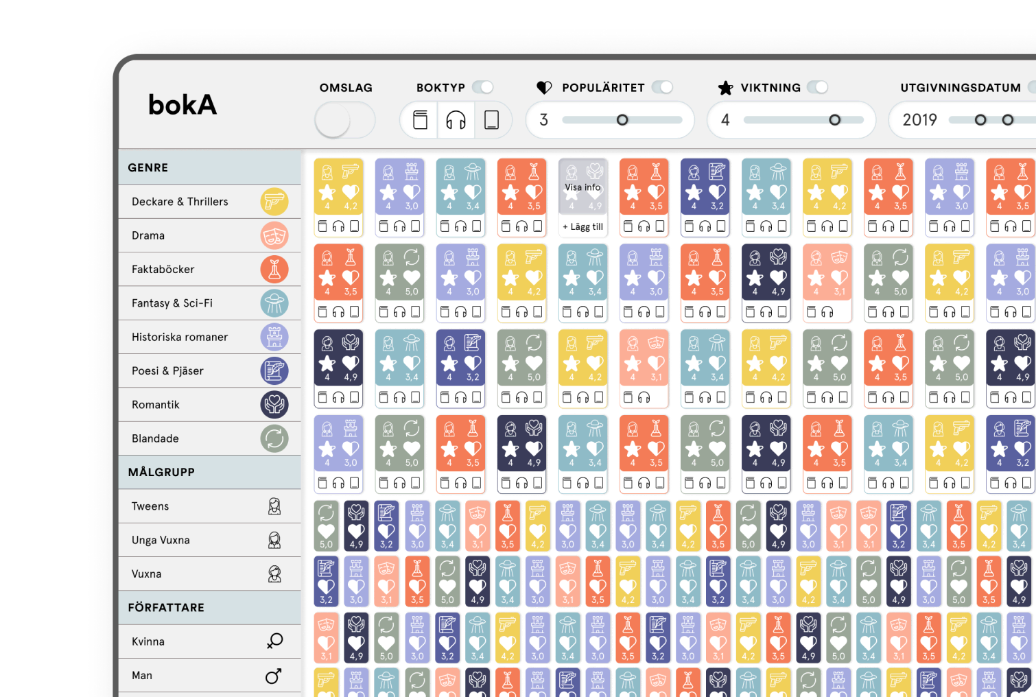
- 100 of these 300 must visualize the following 4 properties:
- genre
- type
- target group
- popularity
- The remaining 200 must visualize at least 2 properties
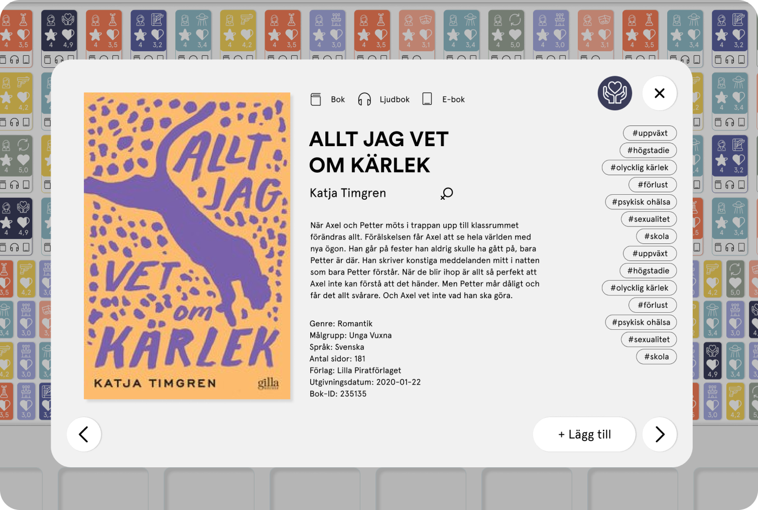
- All books have tags, and the system should be able to show if books have mutual tags
- People with color blindness should be able to use the system
- The user needs to be able to read all the detailed information about a book. (Exception: This can be done with a pop-up)
Process.
Empathize
To be able to understand the user I started with conducting an unstructured interview with a person working in a book store with a lot of knowledge about books and experience with putting together suggestions of books to book circles. I asked questions trying to understand which information about a book is the most crucial and common, and what questions she would normally ask a customer.
I also conducted secondary research by looking up bookstores and library systems online to find information and inspiration from similar services.

Define
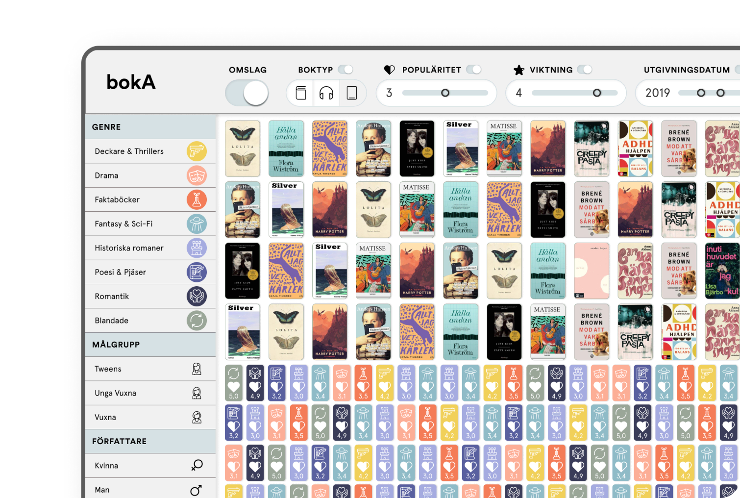
With the information from my research I got some insights to work with. Some of them were realizing that the most common thing to filter the search on, is presumably by genre, followed by target group and date of publication. For some people the design of the book is really important too, and therefore I also decided to include a way of looking at the book cover in my design.
Biggest challenge - To fit lots of information in a small space and still keep it understandable and user friendly.


Prototype
I started out by sketching various layout options on paper and eventually decided on where to roughly place the different components in the system. When this was decided I moved over to Figma to get going with a more detailed view for getting a look & feel of the system.


Test
During the project I frequently conducted a lot of small tests on detailed parts. Such as the icons, colours and different functionalities in the filtration. I did this by asking questions to potential users, "What do you think this icon stands for?" or "What do you think happens when you click this button... or do this or that?". Because the project had a very short amount of time this really helped me to get answers fast and keep up my pace.
During one of my tests I understood the importance of not moving the icons for "type of media" labelled as “boktyp” as this made it easier to quickly understand what types the book existed in or not.
I had from the start decided to use symbols as a way to visualise target group, gender of the writer, popularity and so on. But here I realised it would be a good idea to also include colours in some way. Because my research had given me the information that genre is the most important filter, I decided to use colours here to make that as clear as possible.
To make sure everyone would be able to see the different colours I spent a lot of time on checking them with a colour blindness tool, while also making sure they still looked nice together. This was not easy, but I'm glad I put some time into this as I think it really paid off.
Final Product.
Retrospective.
Challenges.
The biggest challenge with this project was definitely to fit everything in this small area and still keep the feeling tidy and structured. After quite some time sketching and wireframing I also realized that I had missed one bullet in the funcion specification "no scrolling, overlays or etc. is allowed" which I was competely stunned by (to me it felt obvious to use scolling and overlays for menus, hints and so on, but our teacher really wanted to challenge us, and she succeded). By the time I realized my mistake I had lost quite some time which meant that I also had to fight with the time for the rest of the project. Lesson learned — I will always read the brief thoroughly to never miss out on details like this.
Future improvements.
Looking back on the project there are a few things I would like to improve, the text search is one of those things. I see now that it's not super clear how it works and it could need some refinement. The second thing is of course to change the icons for target group, as I know that they are all very similar to one another and hard to tell apart.
I could also see that it might be useful with a function to save one search filtration for later, to make it easier when the user uses the service the next time. I would also perhaps want to include a tool for the user to get recommendations on common search filtrations and book packages for different themes and groups of people, for example.
In retrospect I would also like to add a "clear filter" button to reset the filtrations altogheter to make it easy to start on a clean search slate. In my project I tried to make a visualization of how many books in total and how many books in diffrent genres are in the bock package list (in the bottom) but I feel that it's not as clear as it could be and I'd love to work some more on that.